
Subtle Design Details That Elevate Your App’s UX

The difference is in the details.
If I had a nickel for every time I’ve heard this oft-repeated phrase, I could treat myself to a nice dinner (if it weren’t for the fact that I’d owe twice as much for saying it myself). It’s popular because it’s true.
Getting the details right is at the heart of great app design and user experience (UX). It applies to nearly anything: service, relationship management, operations, and most tangibly, to digital products. Let’s look at a few common interactions and design details that can improve your customer’s experience with your digital products, making users more likely to stick around and come back.
Once you see these details, you’ll never be able to not see (or hear) them in all of the other apps you use — a little like the arrow in the FedEx logo.
Automatic Prompts for Biometric App Security
Over the past five years, it’s become common for mobile apps to offer additional security measures. This is primarily due to user demand in the wake of an endless stream of data breaches.
Biometric sign-ons (like fingerprint authentication or Face ID) are among these available security measures, and they are a convenient way to authenticate a user. They’re fast and secure, and practically “set it and forget it.” Most mobile phone users set this up for their default mobile device security measure. When doing app development for our clients, we always recommend integrating this feature, especially if they deal with sensitive or private content.
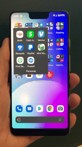
To ensure a seamless experience, however, it’s important not to put up additional roadblocks. Don’t make them tap a button to scan their face or fingerprint. For example, Bank of America automatically asks users for a scan as soon as they open the app, which creates a seamless experience.
Your app needs to offer the user’s preferred sign-in method without additional prompting.
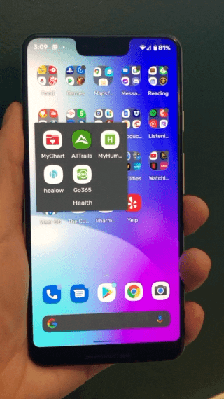
Piedmont Healthcare’s MyChart app requires a user to interact with an icon before they can scan their fingerprint for authentication. Don’t do that.
Bonus: if you want to make life even easier for your customers, program your app to communicate with the device’s operating system. When loading the app, have it check if biometrics were used to unlock the phone. If they were and if your app also uses a biometric unlock, you can automatically pass a user through your app’s authentication (because they’ve already authenticated when they unlocked their phone). MAGIC.
Custom Notification Sounds for App Messaging
Notifications can be overwhelming for users but done correctly, they can also increase engagement and improve the usefulness of your app.
A user typically engages with a notification through a two-part process:
- They are alerted to the notification through a physical (vibration) or auditory (sound) prompt
- They check their phone to read the notification
If you want to make your notification stand out, there isn’t much room to differentiate through step 2, the visual component of the notification that users read. Operating systems usually provide a few non-customizable templates for notifications. However, you can give your app a better chance to catch users’ attention — and help reduce confusion or annoyance — thanks to the notification sound settings.
Apps can provide custom sounds for their notifications. Many rightly don’t because system-level sounds are fine for most situations, including shopping updates, news updates, and special offers. But that means it can be difficult for users to diagnose what is important or time-sensitive. Even most email and text apps use the default notification sound, leaving users that haven’t customized their sound preferences to drown in a sea of identical-sounding notifications.
If you have an app that has a messaging component (like in-app chat or message boxes), package a custom sound as the notification.
When a user receives a notification from you, they will be able to hear the prompt without looking at the device and decide whether it’s worth responding to immediately. This creates a two-fold benefit: (1) users can distinguish your notifications from others and (2) they can prioritize your notifications over others.
A good comparison is Discord and Twitter. For the uninitiated, Discord is a community-based chat app where users communicate with voice calls, video calls, text messaging, and more. It’s particularly popular in the online gaming community. Twitter is a social media app. What they have in common is direct messaging. Twitter uses the default notification sound for their direct messaging, while Discord direct message notifications have a unique sound. Users always know when an incoming communication is from Discord. Twitter direct messages can easily get lost among all of their other notifications, meaning they might be more likely to be ignored and users could miss an important message.
Maximize QR Codes & Barcodes
Many of us remember the good old days of plastic loyalty cards on our car key ring. But nowadays, most of us use our phones to scan loyalty cards at physical locations. The benefits that come with this change — consolidation, no issues with faded or abraded codes, and hands-free interactions — outweigh the nostalgia.
While there is some ability to integrate loyalty cards more deeply into the mobile OS (Hi there Apple Wallet and Google Pay), most companies have their scannable components only in-app. There is nothing wrong with this approach.
If you use a barcode or QR code in your app: allow access to a full-screen view of the code.
Proximity to scanners and size of the code are the two main factors that determine whether a code is read successfully. If the code on a user’s phone is small, they have to physically move their device closer to the scanner. Small codes are particularly frustrating when users are at drive-thru windows.
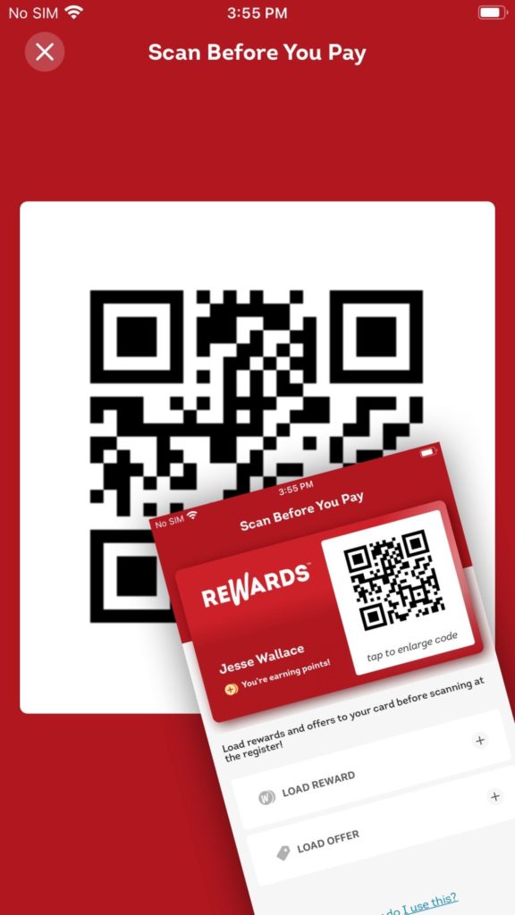
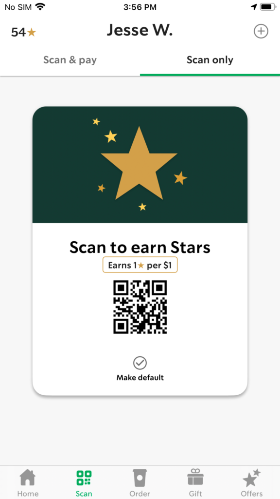
Wendy’s mitigates the issue of small codes (and failed scanning) as much as possible by allowing a user to ‘tap to enlarge’ to show a full-screen view of their QR code. Conversely, Starbucks uses a small version of their code, with no way to enlarge it. I’m sure I’m not the only one that has hung halfway out of my window at a Starbucks so that they can scan my card. I love my 135° skinny cinnamon dolce lattes though, so here’s hoping Starbucks upgrades their QR code to Venti size.
Prevent Accidental Dismissal of Permissions Dialog
The final UX detail only affects Android apps, so Apple folks can sit this one out. By now, users on both platforms are familiar with the process of accepting location and notification permissions when they download and install a new app. But we aren’t dealing with user disposition towards permissions today. Instead, we want to look at users that accidentally bypass the permissions prompt.
On iOS devices, when permissions are requested, the screen is blocked by the permission modal and users have to make a selection. This is how permissions should be designed. But Android’s system permission interface doesn’t require a selection, and permissions are automatically denied if a user happens to tap anywhere outside of the modal.
Let’s look at a real-world scenario to see why this is a problem. If a user is holding their phone with one hand and a part of their thumb brushes the screen before tapping a selection, the system believes they are trying to dismiss and denies the permissions. (I’ll give you 3 guesses who this has happened to.)
This can cause problems with many apps that rely on these crucial permissions. Poorly designed system interactions like this can cause frustration. This frustration can be mitigated by good UX.
To help prevent accidental denials, add a secondary custom prompt when a user dismisses to remind them of the value of granting permissions.
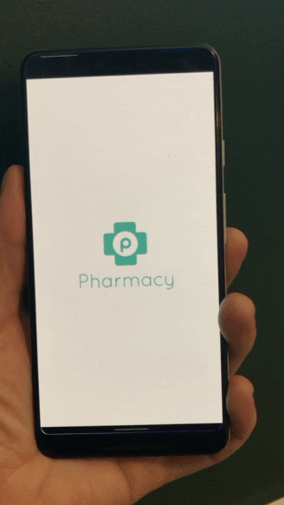
Both Chick-fil-A and Yelp address this well, with supplemental screens that encourage users to enable permissions. These screens not only surface the value of granting permissions but also serve as a valuable error prevention tool. On the other hand, the Publix Pharmacy app doesn’t provide any prevention denial when a user is trying to locate a nearby pharmacy. If a user taps outside the permissions modal (on purpose or accident), they’ll get an error state when they try to click on the map where it looks like the map won’t load.
Ignoring small but important details in the UX can decrease the trust a user has with your product, cause frustration and, in some cases, mean a user isn’t able to operate the app correctly. So we could have used the phrase ‘the devil’s in the details,’ but at Dragon Army, we like to think a bit more positively.
If you are looking to start a new project on the right foot, address existing issues, or elevate your current experience, give us a shout! We’d love to see what’s on your radar and how we can help you deliver the best possible experience to your users.